This Spring 24 Semester, Our first assignment was to create microinteractions for Smart Watches. The Challenge is that we need to create and design microinteractions in the small real estate given.
The brief given to our cohort is:
Start by selecting one of the task from the following list:
Checking the weather
Checking the time
Setting the timer/stopwatch
Creating and receiving reminders
Recording and reviewing voice notes
Taking and reviewing voice calls
Sending and receiving SMS text
Checking the time
Setting the timer/stopwatch
Creating and receiving reminders
Recording and reviewing voice notes
Taking and reviewing voice calls
Sending and receiving SMS text
Alternatively you can pick another task that is facilitated by a smart watch.
In this project you will use Figma to create the prototype of your microinteraction. You can choose watchOS or WearOS but your interaction has to comply with the design guidelines for the selected platform:
https://developer.apple.com/watchos
https://developer.android.com/design/ui/wear
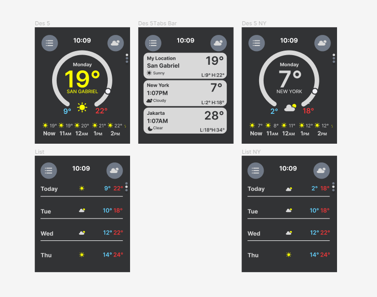
I chose "Checking the weather" app for my microinteraction design challenge.
I began by researching Apple's WatchOS design guidelines from the link provided. I read the article and watched a video from Apple themselves explaining these guidelines to designers. It was beneficial and informative for me. I learned a lot about what goes into designing these small interfaces.
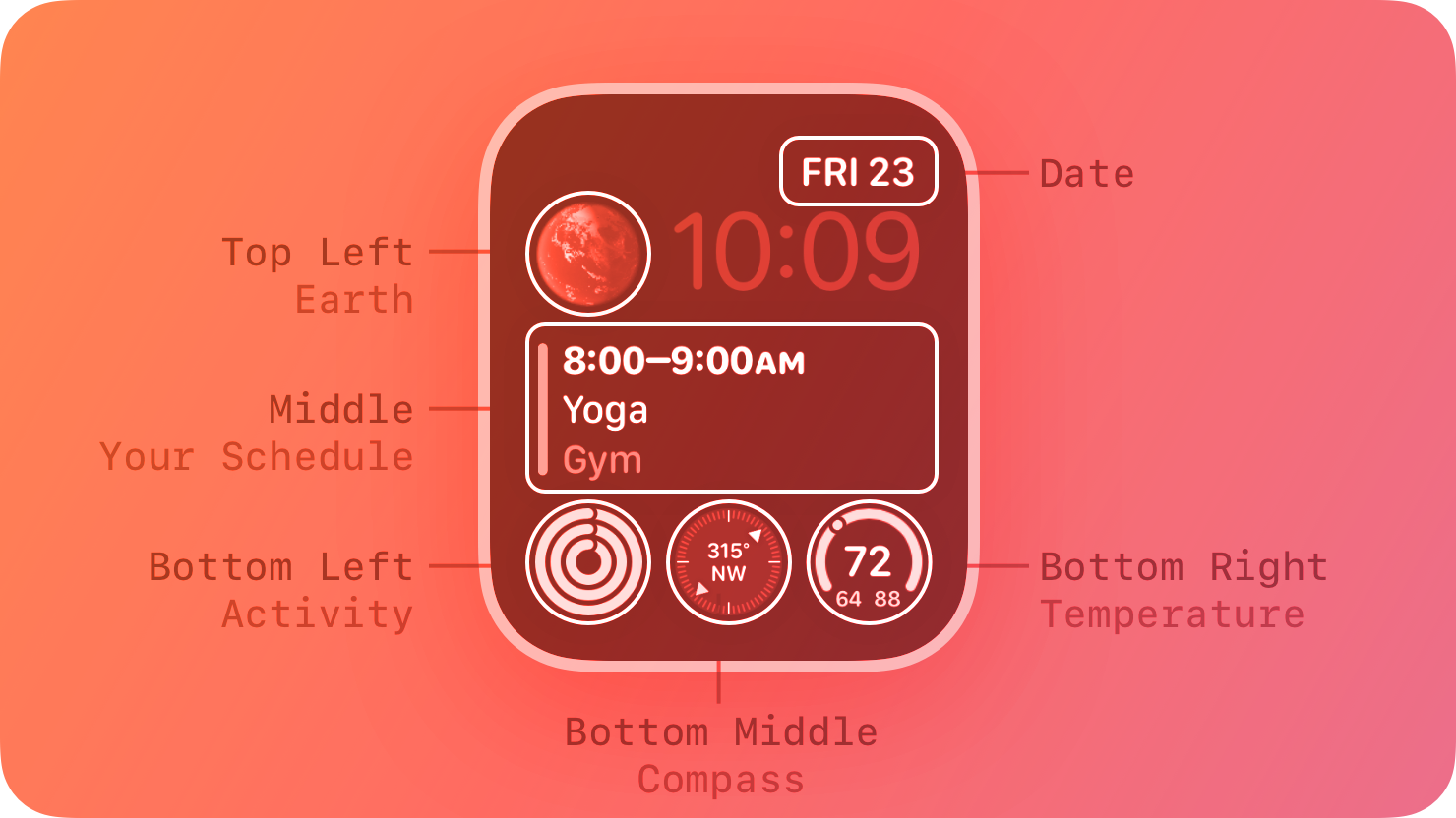
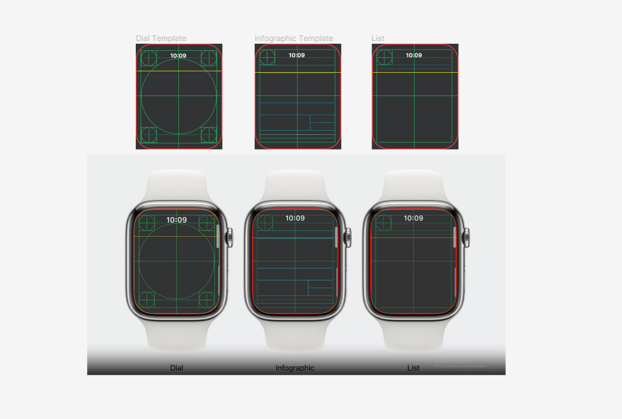
Complications
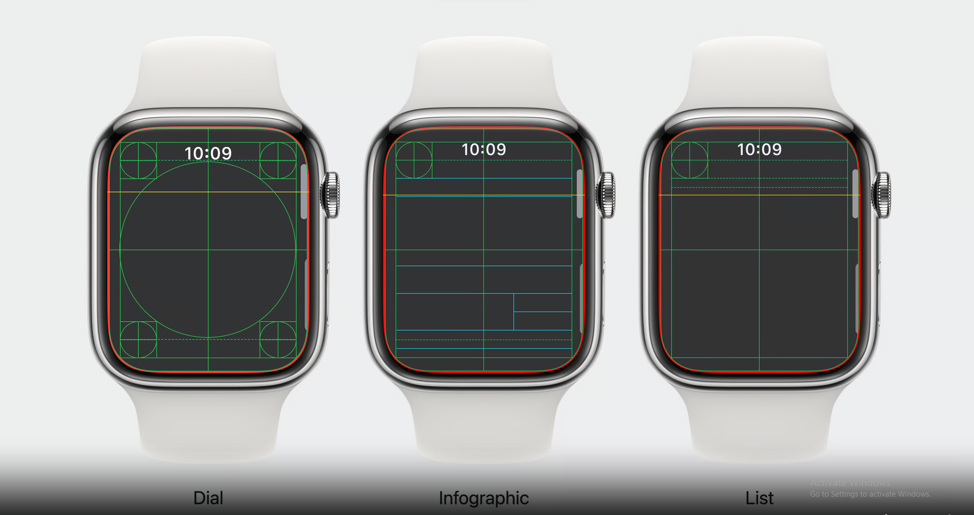
WatchOS Templates
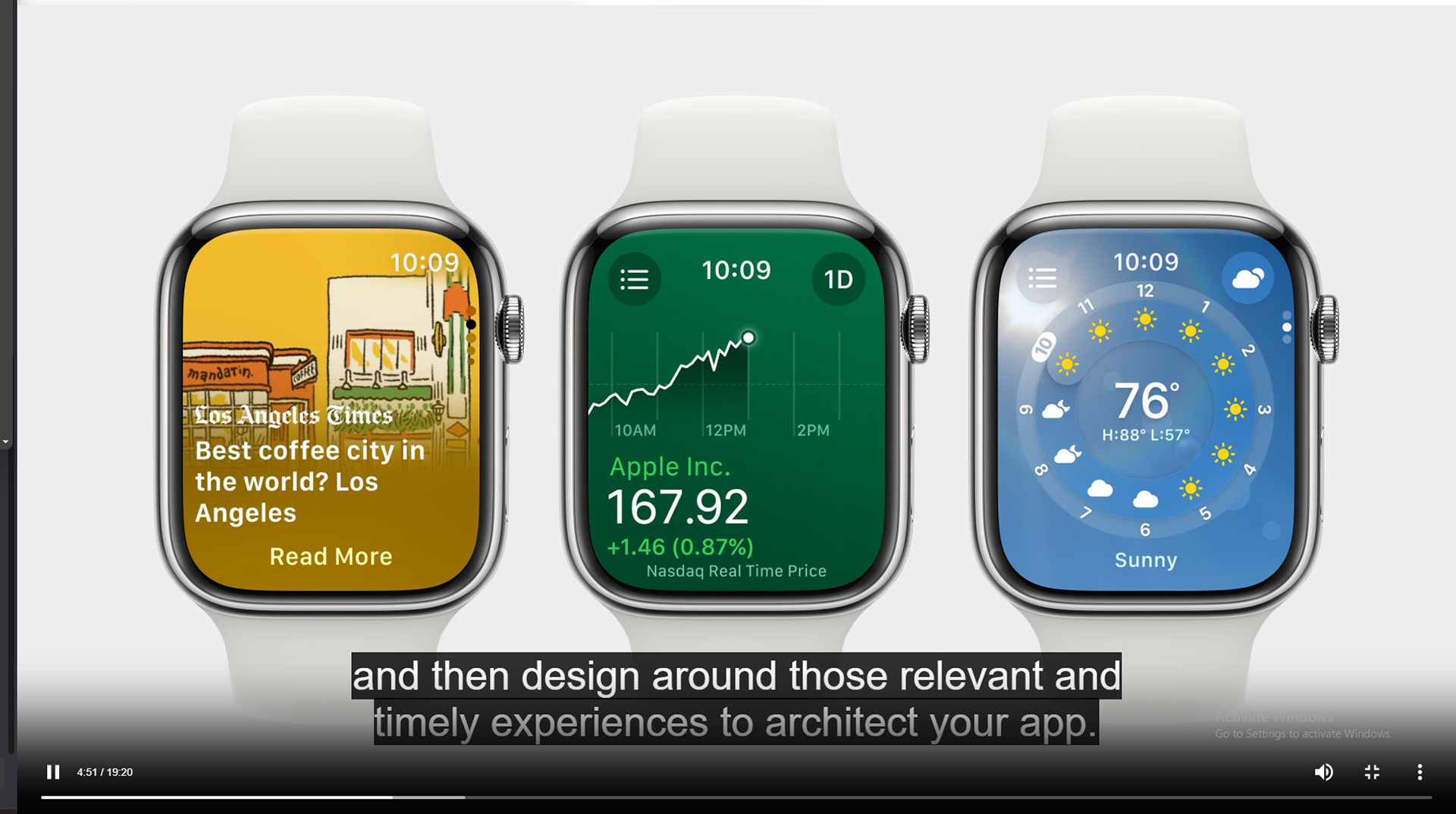
Clip from Apple's Video
After watching the video and reading the article, I tried to redesign Apple WatchOS' Weather App UI.
I recreated Apple's WatchOS Template because I couldn't figure out how to download the template, because the template is in .dmg format, and I don't own a Mac.
Then I just started to recreate what Apple's current UI looks like to see where I can change something, and take what works and remove what doesn't. I like to think about what I look for when using the weather app myself since I am an avid user of the weather app.
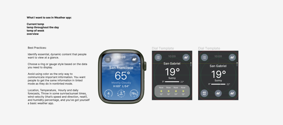
Once I figured out what I wanted to see in the weather app, I tried designing UIs and then presented them to the class on our Thursday night lectures for feedback. My Cohort liked Design 2 the most, while my professor leaned toward Design 3 more. He gave me great feedback on my concerns and reworked my designs to meet his criteria.
I myself was leaning toward Design 2 because I thought it was a cool idea if I could create an interaction with animation acting like a dial that can change the time and weather to see what the weather in the future, kind of like the clip I saw in Marvel's Moon Knight scene.
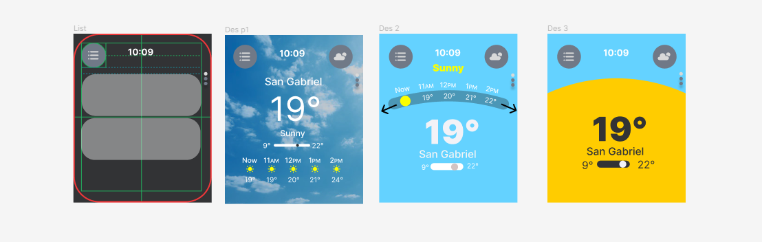
As I was looking for tutorials, I quickly realized my skills was not able to recreate what I had imagined in my head, and so I had to recreate my design and think of other ways to make it work. I went back to Apple's guideline and saw they use a lot of circular designs and open and close gauge designs. I like this idea and so I got to designing.
My thoughts were: I wanted to keep the design of a thermometer to communicate the highest and lowest temperature to users. What I did was instead of getting rid of it, I turned the flat bar design into an open gauge design and incorporated it in the UI.