ROLE
UX Researcher, UI Designer, Visual Designer, Motion Prototyping
YEAR
Spring 2025, 16 Week Project, Solo Project
HOW MIGHT WE..
improve Valorant's HUD/UI to enhance clarity, accessibility, and player experience?
For our capstone, we were asked to identify a real-world problem we care deeply about and propose a research-backed design solution. As an avid FPS gamer, I focused on VALORANT's confusing HUD, specifically its lack of clarity for suppression and other status effects—which often leads to misplays, especially under pressure.
For our capstone, we were asked to identify a real-world problem we care deeply about and propose a research-backed design solution. As an avid FPS gamer, I focused on VALORANT's confusing HUD, specifically its lack of clarity for suppression and other status effects—which often leads to misplays, especially under pressure.
WHAT IS VALORANT?
Valorant is a 5v5 competitive first-person shooter developed by Riot Games. Think Counter-Strike — but with agents (or characters) who have special abilities, like teleportation.
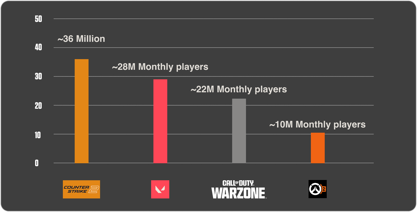
It’s one of the biggest games in the world, with over 28 million monthly players and a thriving esports scene.
In games like Valorant, every second counts. One missed cue can be the difference between winning and losing a round. That’s why I kept Riot’s core design value of “Player First” at the heart of my design decisions.
As both a designer and a player, I’ve noticed how unclear UI can lead to critical mistakes — even at the pro level.
PROBLEM/INSPIRATION
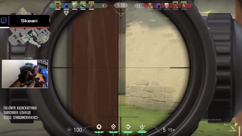
Now, Imagine this. You're at the Valorant World Championship. The crowd is roaring. You're Zekken — one of the best players in the world. You’ve practiced endlessly.
But then, you and your teammate fall off the map. It wasn’t your aim. It wasn’t strategy. It was confusion — caused, potentially, by the UI.
One day while watching the Valorant world championships of my favorite team, I noticed that they made a rare misplay, which cost them to lose that round and got them kicked out of the tournament. As a hardcore fan, this pissed me off, and couldn't accept the loss. So I took a closer look at this exact replay/moment and noticed something that became my theory. A UI overlap, causing mistakes in high-pressure moment.
One day while watching the Valorant world championships of my favorite team, I noticed that they made a rare misplay, which cost them to lose that round and got them kicked out of the tournament. As a hardcore fan, this pissed me off, and couldn't accept the loss. So I took a closer look at this exact replay/moment and noticed something that became my theory. A UI overlap, causing mistakes in high-pressure moment.
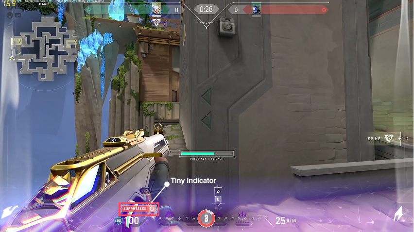
WHAT HAPPENED?
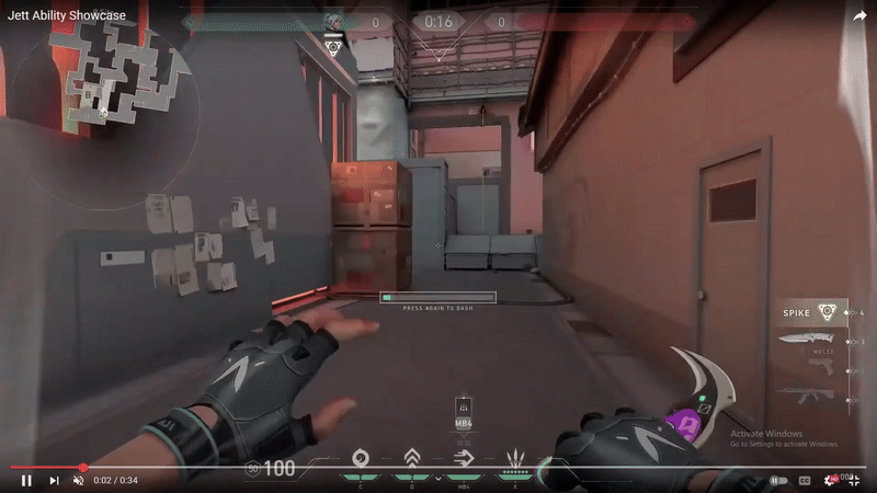
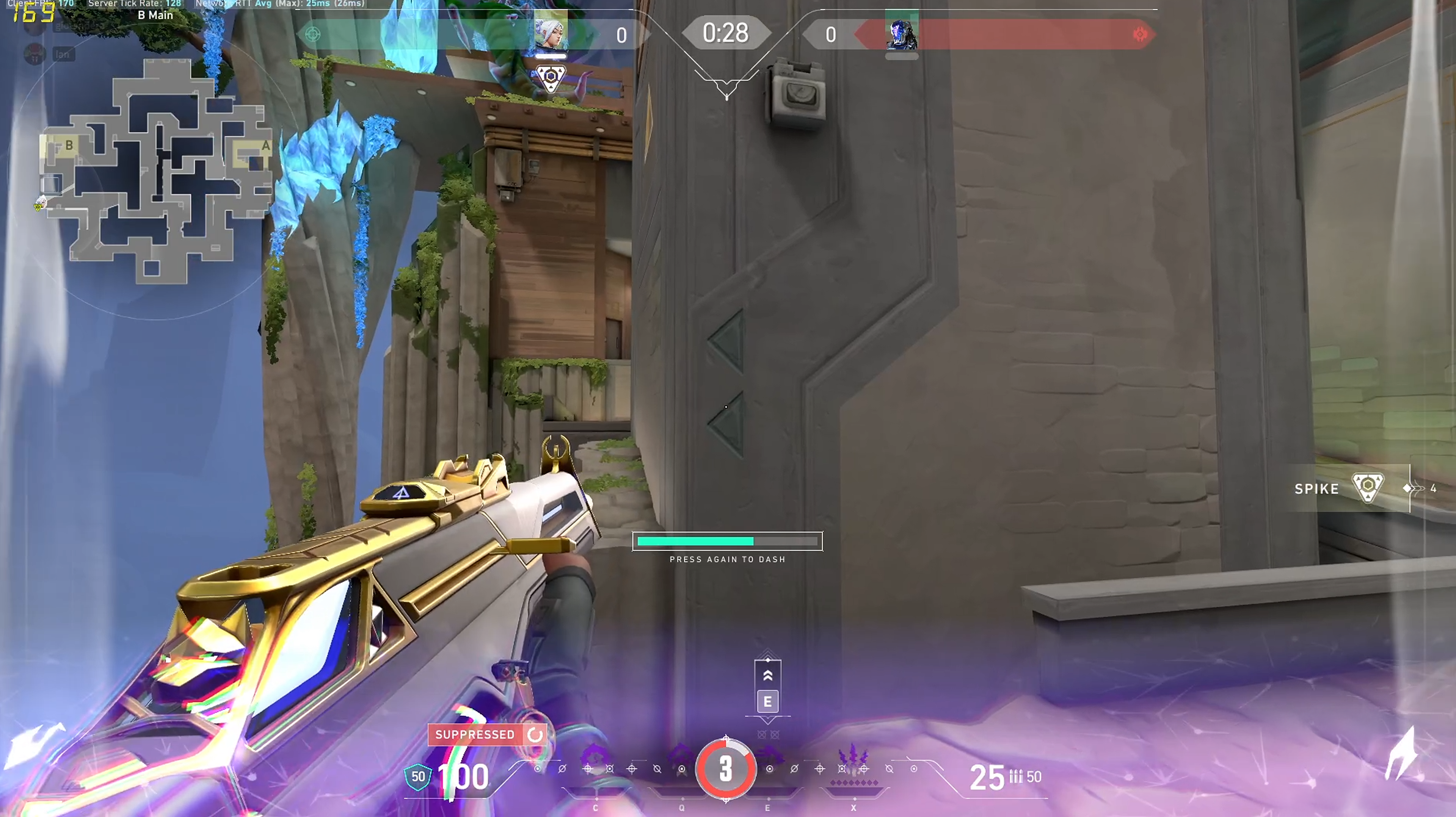
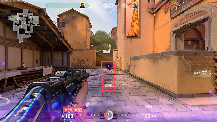
In Valorant, Jett has an ability called Tailwind, which lets her dash in a direction she is in moving.
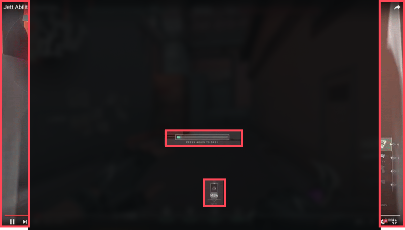
When activated, a wind trail fx like this, and timer shows up. These UI elements communicates to users that they can use the ability.
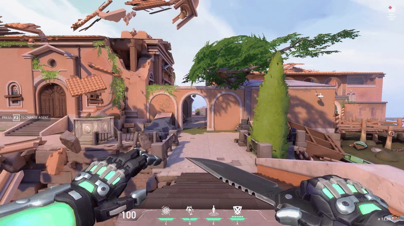
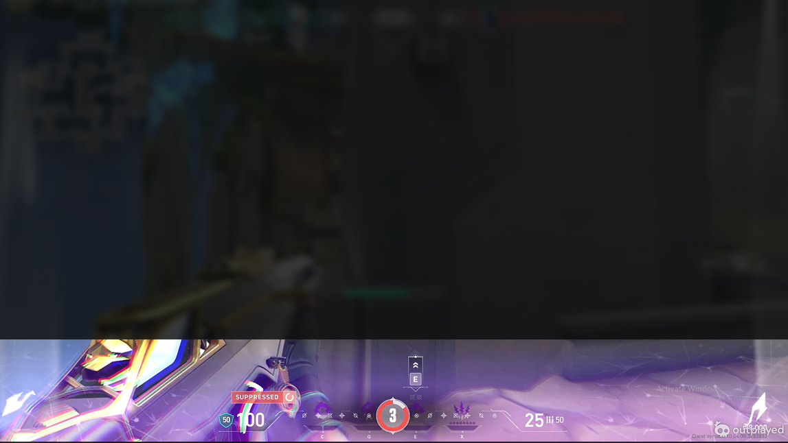
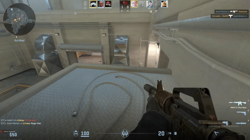
Another character, KAY/O, has an ability called null command that prevents enemies from using ALL abilities for a short duration.
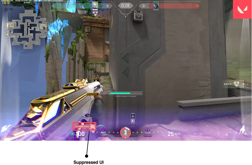
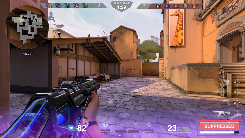
Players will see a purple glitchy effect on the bottom of their screens when suppressed, as well as these suppressed indicators.
THE PROBLEM
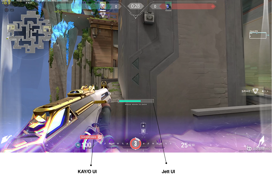
The problem is that when we are suppressed, Jett's ability UI is still there. This UI overlap CAN create confusion to players.
PROJECT CHALLENGE
Problem
Players—casual and pro alike—struggle to quickly identify suppression and other overlapping status effects in VALORANT’s HUD, often leading to decision-making errors and frustration in clutch moments.
Insights
Through interviews, Reddit research, and user feedback, I found that suppression effects were often missed due to vague visuals and inconsistent placements, especially among colorblind users and in noisy combat situations.
Solution
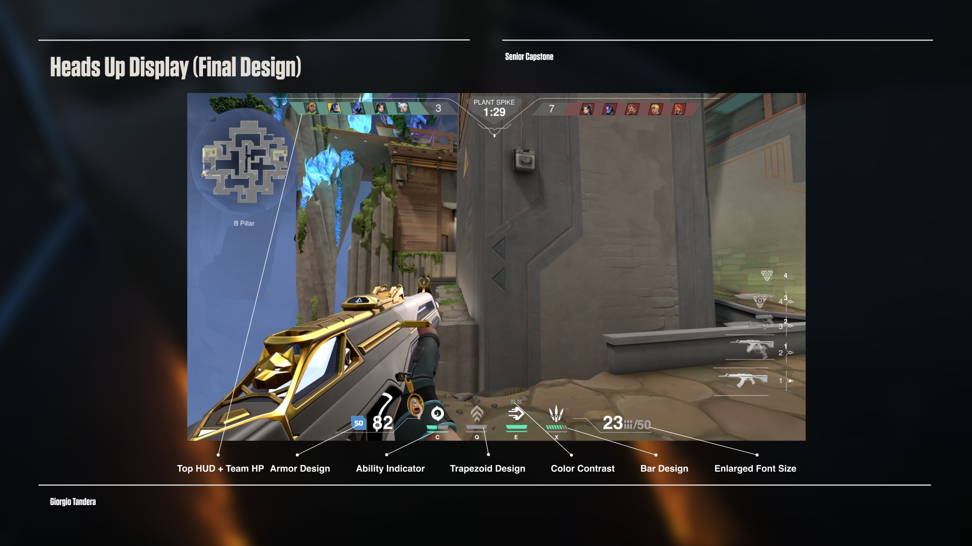
I redesigned VALORANT’s HUD using a player-first lens, prioritizing readability, animation timing, and visual contrast. The new design isolates status effects in consistent screen areas and uses distinct shapes and animations to reduce cognitive load.
Players—casual and pro alike—struggle to quickly identify suppression and other overlapping status effects in VALORANT’s HUD, often leading to decision-making errors and frustration in clutch moments.
Insights
Through interviews, Reddit research, and user feedback, I found that suppression effects were often missed due to vague visuals and inconsistent placements, especially among colorblind users and in noisy combat situations.
Solution
I redesigned VALORANT’s HUD using a player-first lens, prioritizing readability, animation timing, and visual contrast. The new design isolates status effects in consistent screen areas and uses distinct shapes and animations to reduce cognitive load.
PROCESS
Gaming UX/UI is a field where clarity and speed of information are critical to player experience.
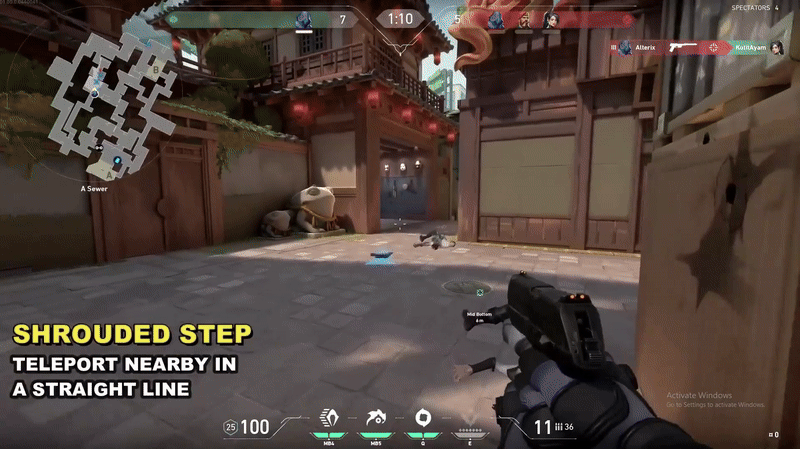
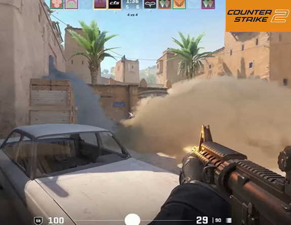
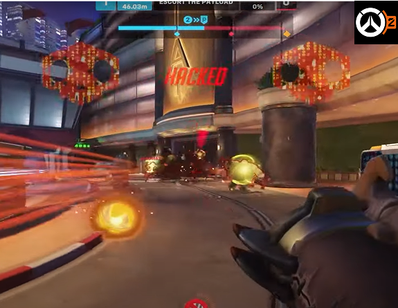
I looked at competitors such as Marvel Rivals, CS2, and Overwatch 2 to find gaps and opportunities for improvements in Valorant.
For example, Overwatch uses big, centered status indicators like "Hacked." While Valorant, uses small indicators — easy to miss.
PROTOTYPE
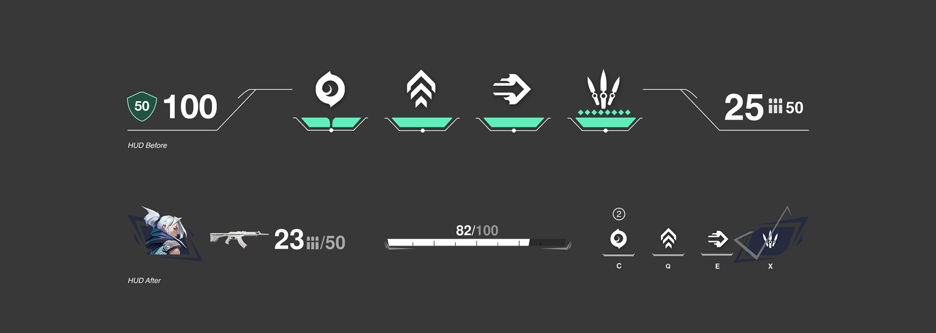
Current Suppressed UI
Redesigned UI
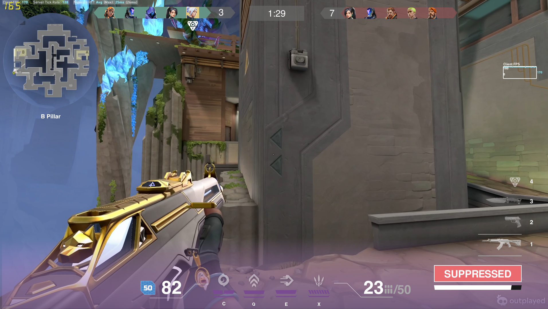
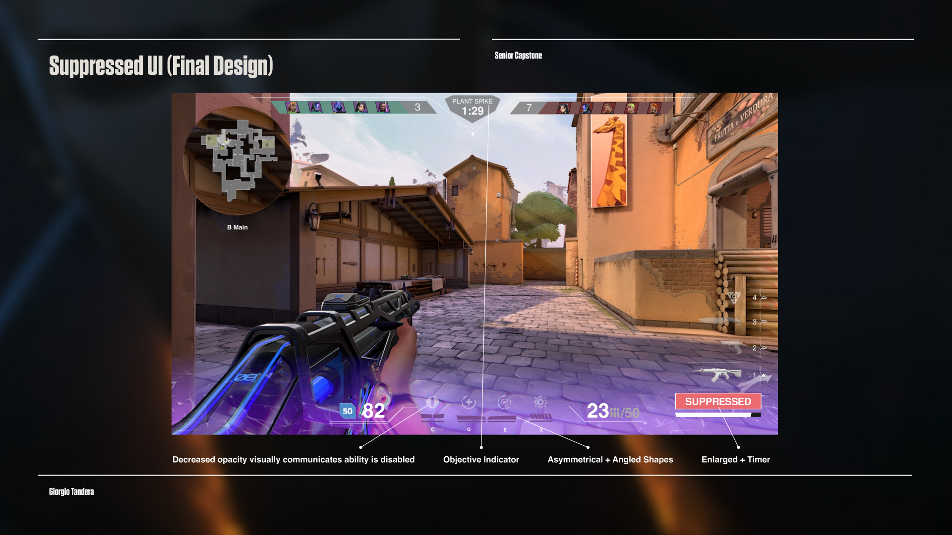
I think Overwatch does a good job here. My first prototype focused on the suppression overlap issue—removing distracting effects like Jett's UI and creating a big, clear “SUPPRESSED” design for Valorant.
Next, I tried experimenting and gave the HUD a new look to see how the community would feel.
RESEARCH | REDDIT P1

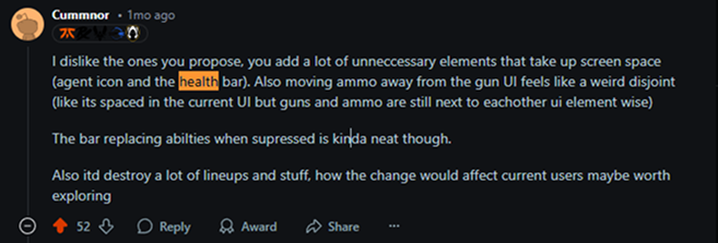
Sourced community frustrations and benchmarked clarity standards from games like Overwatch and CS2. I used the competitive Valorant subreddit to gather user feedback and here's what I learned.
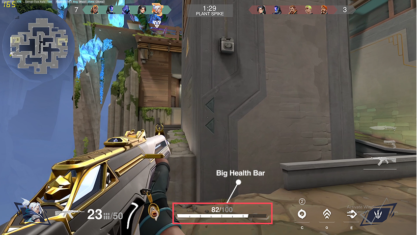
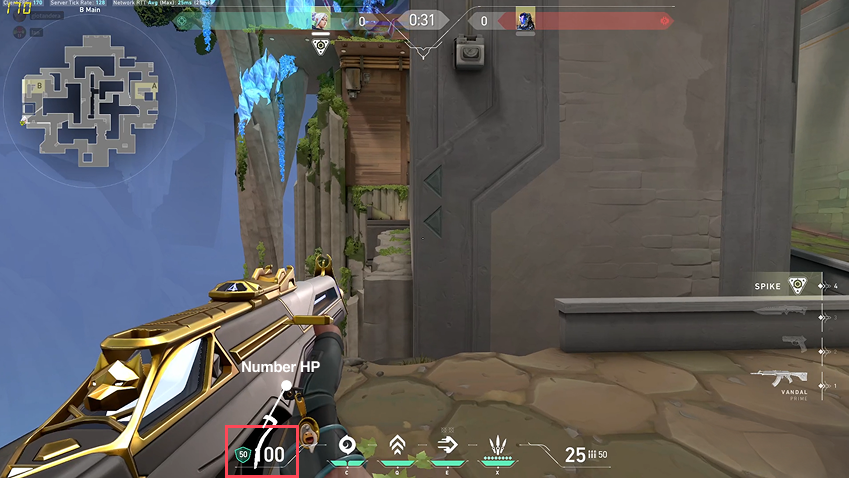
1. The big health bars are overrated and they did not like it. Expressing that big health bars doesn't make sense in a fast time to kill game like Valorant. They prefer a simple, scannable number HP that isn’t too distracting.
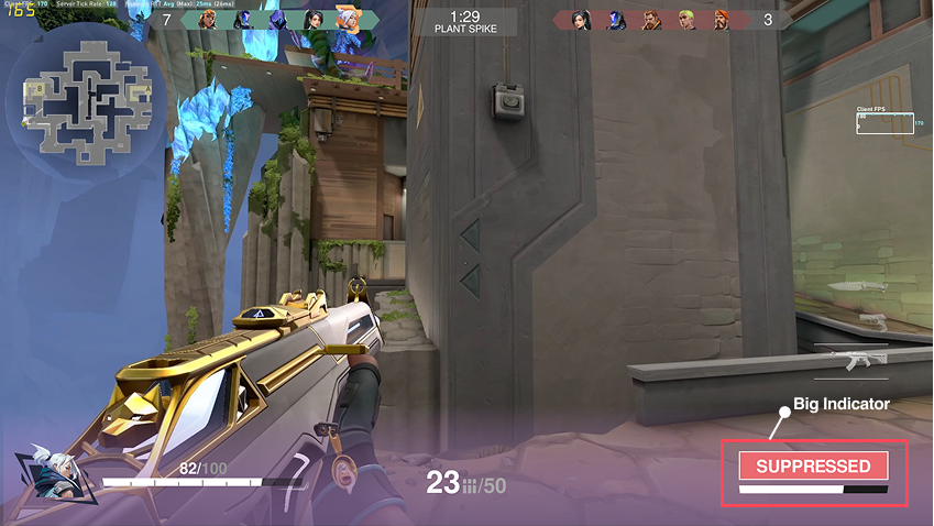
2. Players liked the big suppressed indicator from the current tiny one.
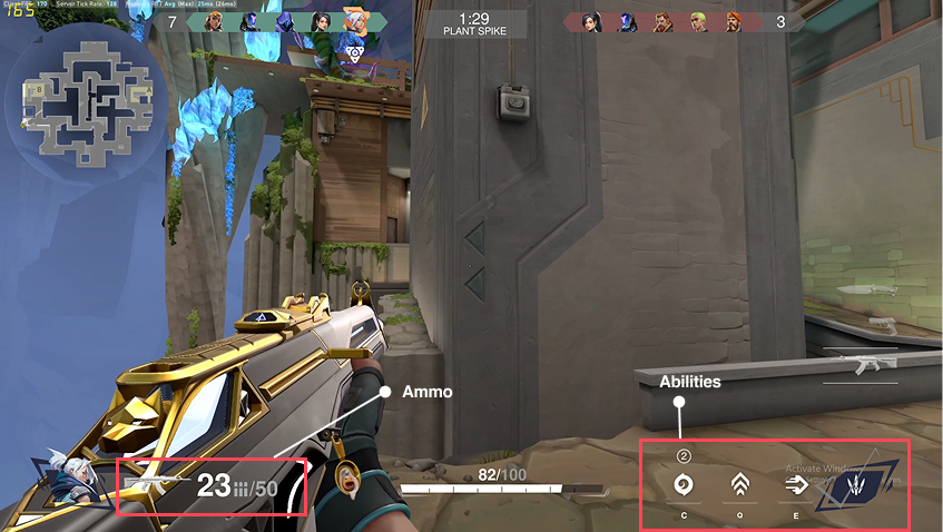
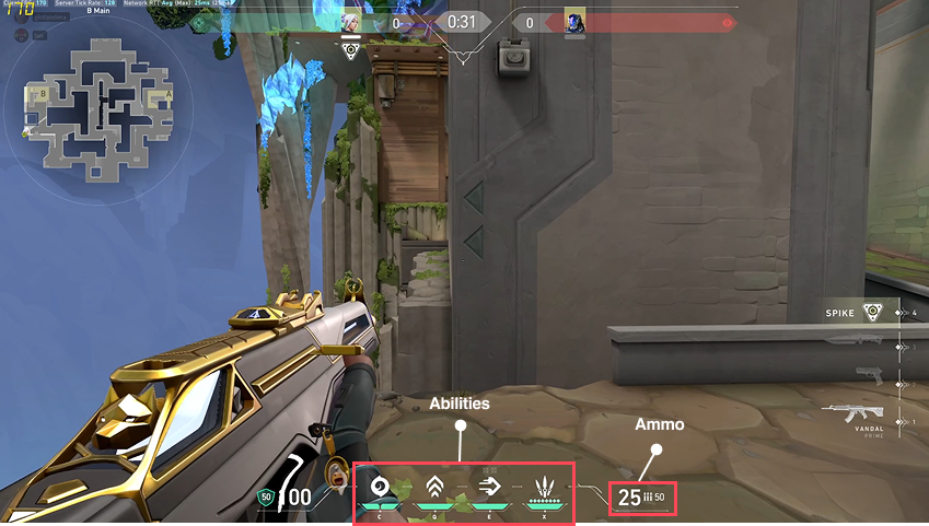
3. They feel the ammo and abilities should be closer together rather than apart from each other.
RESEARCH | COFFEE CHAT INSIGHT

Next, I sought guidance from industry professional Jennifer Morehead, a Digital product manager at Activision. These are my insights.
1. She validated that I have a strong theory but challenges me to seek validation from the community to support my theory.
2. She also encourages me to explore player churn and find out what the emotional cost of bad UI and if this can lead to player leaving the game.
RESEARCH | PLAYER INTERVIEWS
I interviewed JJ, a top 1.14% Valorant player about my redesigns.
Three insights stood out to me:
1) He relies on bottom-screen UI most.
2) Status effect confusion is real — even at high rank.
3) He wants consistent visual feedback for all status effects.
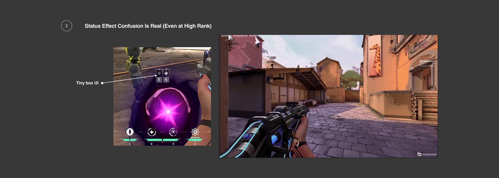
His UI confusion was with a different character, Reyna. When Reyna eliminates an enemy, a purple orb like this appears and a tiny box UI pops out to users which communicates to players that they can use the ability.
Here's a quote from JJ that highlights his frustrations, he says:
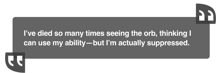
Again, there is a consistent problem when we are suppressed, Reyna's ability UI is still there. This UI overlap CAN create confusion for players.
Here's a simple solution that can help eliminate the problem.
I removed orbs and the bar and added the big suppressed UI on the bottom right corner.
Removing these UI elements can create a better player experience.
Removing these UI elements can create a better player experience.
RESEARCH | REDDIT P2
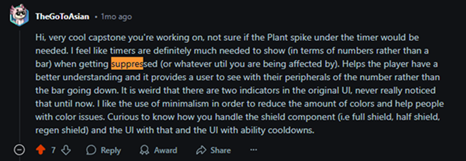
The feedback I received, compiled, and synthesized was helpful to understand player needs better, with that, I redesigned the prototypes and sent them over to Reddit again. This time I got over 36k view, 124 upvotes and over 27 comments. Here's what I learned.
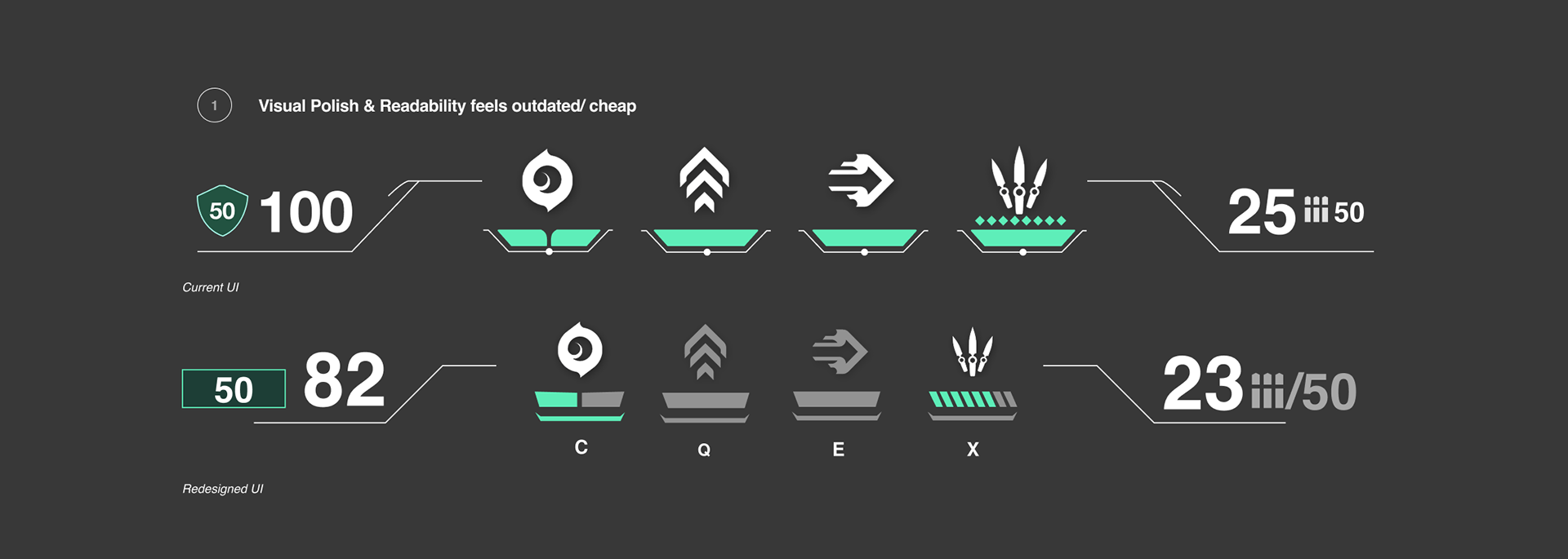
They feel like the visual polish feels like a mobile game and cheap.
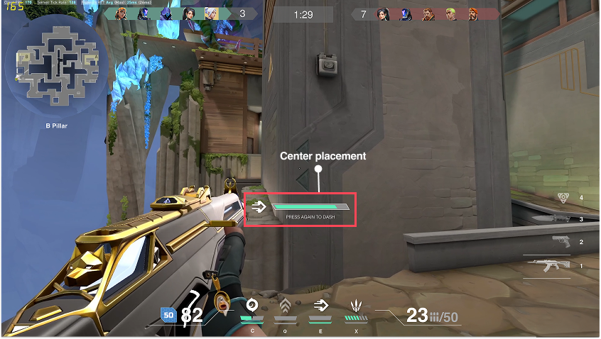
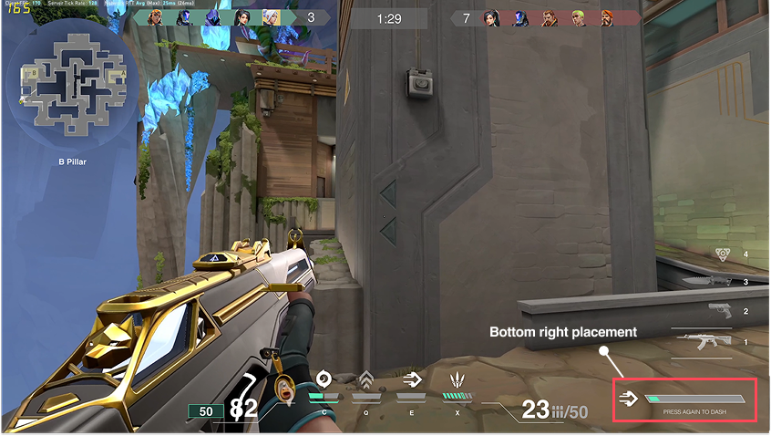
They have mixed opinions on the new placement of the timer from the center of the screen to the bottom right.
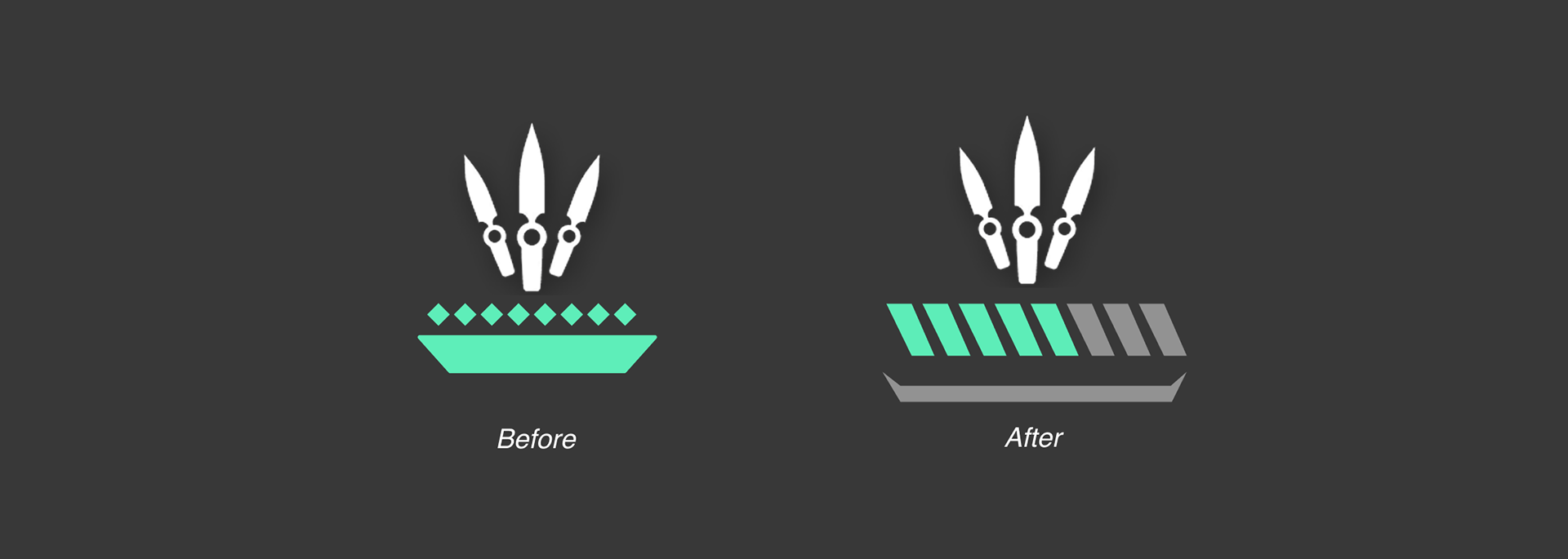
They love and prefer the new Ultimate ability design.
REFLECTION
The Valorant UI Redesign project was a deeply personal and challenging journey — one that pushed me emotionally, intellectually, and professionally. From the beginning, I knew I wanted to take on something ambitious, but I underestimated how intense it would be to redesign a live, competitive game interface that thousands of players interact with daily. This wasn’t just a design project, it was a chance to prove to myself that I could speak Riot’s language, and that pressure created its own form of anxiety.
One surprising thing I discovered was how much humility and resilience this project demanded. I went in thinking that being a long-time player would give me an edge — but what made the difference wasn’t just experience, it was listening. Reading unfiltered Reddit feedback, interviewing a high-ranked player, and presenting to Riot professionals made me realize that good design isn’t about defending your ideas — it’s about being curious, coachable, and focused on what the player actually needs.
Throughout the process, I faced several constraints — mainly emotional. I felt the weight of wanting to impress the Riot professionals who came to our capstone review. There was also technical tension: balancing visual polish with performance clarity, making sure changes didn’t clash with Valorant’s established art direction, and adapting my UI decisions for accessibility. My biggest challenge was refining my scope. I had to choose whether to focus on general HUD cleanup or go deep on suppression effects. That forced me to think more strategically and commit to a core message.
Looking back, I can say this was one of the most transformative projects I’ve done. If I could change anything, I would have conducted more structured user testing earlier — especially for accessibility and playtesting under real match conditions. That kind of feedback could’ve helped me tune the details even more. I also wish I had introduced the functional prototype earlier in my presentation; it would’ve added clarity and impact.
Still, this experience taught me that I’m capable of more than I thought. I walked away not only with a better UI solution, but with a better understanding of how to design under pressure, how to process feedback without ego, and how to speak the language of game UX professionals. This project helped me realize I’m not just a student — I’m a designer ready for the real world.